Apple is one of the most well-known companies on the planet. Its logo is immediately recognizable, despite being relatively plain and simple. The iconic Apple logo has changed several times over the years, but is the current iteration the best?
It's pretty amazing that the Apple name and logo have been able to acquire such massive brand recognition. Afterall, "apple" is a very basic word---one of the first kids learn to say and spell---and the logo is not far from most depictions of the fruit. So how did we get here?
1976
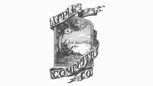
The first Apple logo looks more like something you'd find in 1876 than 1976. It's a black and white illustration of Issac Newton reading a book under an apple tree. As the apocryphal story goes---perhaps the most famous tale in all of science history---Newton watched an apple fall from a tree, which inspired the theory of gravity.
This logo was designed by an entrepreneur named Ronald Wayne, who allegedly left Apple just 12 days after the company was founded---though Steve Wozniak says it was after a few months. Regardless, like Mr. Wayne, this logo did not stick around long after.
1977
Just one year after the company was founded, Apple updated its logo to the iconic Apple silhouette we know today, and a stylized lowercase "Apple" wordmark. The logo was created by Rob Janoff, a graphic designer with the ad agency that Apple hired in 1976.
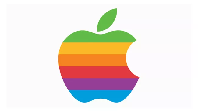
This logo did two important things for Apple's brand. First, it integrated the "Apple" name, which was nestled nicely inside a bite taken out of the Apple icon. Second, it showcased six color bands that signified the color graphics capabilities of the Apple II computer. Both of these characteristics, the bite and the rainbow, would stick around well past this iteration of the Apple logo.
1984
Seven years later, Apple brought on Landor & Associates, who simplified the logo to just the plain six-color banded apple with a bite taken out of it. The colors and shape were slightly updated as well. This was when the company started primarily featuring the Apple icon sans-wordmark. Thanks to a growing fanbase and a saturation of the educational market, the logo could stand on its own.
The six-color banded apple is considered by many to be the "classic" Apple logo. It was used in some form from 1977 all the way until 1998.
1998
The late 1990s update to the Apple logo was certainly a drastic departure from the colorful logo the brand carried for the previous two decades. The catalyst for the change? Steve Jobs returned to Apple in 1997 after being forced out of the company in 1986. One of the first things he did was attempt to reposition the company as more of a luxury, premium brand. To go along with Apple's new line of silver computers, the iconic Apple logo was repainted in solid black.
The plain black Apple icon is an admittedly boring logo, but it does show just how recognizable the brand had become. Despite some hard times in Jobs' absence, the company still had enormous brand recognition, and a plain black logo represented the elegant simplicity it would become known for over the next decade.
2001
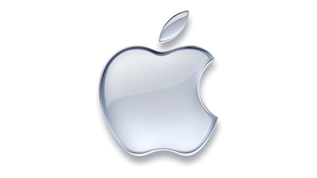
In 2001, Apple gave the iconic logo a glossy 3D effect. This version of the Apple logo was a little more fluid than past variations. It could be found in various shades, sometimes with a shadow, other times without. Sometimes it looked like metal chrome. Other times it looked more like glass.
Apple's software design took on a skeuomorphic look---the design concept where digital elements take on the appearance of their real-world counterparts---and this logo fit in well with that tone.
2015
The flat logo never fully went away during the 3D phase, but around 2015, Apple started to ditch the glossy effects, and went back to the simple flat logo full-time. That's the logo the company uses today.
It's primarily seen in black, white, and gray. However, it gets a burst of color from time to time. While the shape has been slightly refined over the years, this is still essentially the Apple logo from all the way back in 1977. That's impressive.
Which Logo is the Best?
Now that we've seen them all, the question begs to be asked---which logo is the best? Personally, I think it's hard to argue against the 1984 six-color banded Apple logo. It's the classic silhouette we know and love, with the added bonus of some fun colors.
A lot of corporate logos these days are very flat and muted. It's nice to see a little color and personality. However, the great thing about the current Apple logo is it can have the best of both worlds. I get why you might not want a splashy rainbow in every situation. But if you grew up in an area of ubiquitous Macintosh computers in every school, it's hard not to be a little nostalgic for the rainbow version.
All in all, Apple's branding has almost always been spot-on. They've leaned into the apple theme with Macintosh, and the "i" naming scheme has become as iconic as the logo itself. Good branding plays an important role in a company's success, and whatever logo you prefer, it's clear Apple passed the branding test with flying colors.


